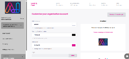
The Look & Feel section allows users to customise the visual appearance of all associated DOXAI service dashboards. Users can tailor the interface to align with their organisational branding. Users can tailor the interface to align with their organisational branding by updating:
Primary Color (e.g., button background, sidebar, main highlights)
Primary Contrast Color (text on primary backgrounds)
Text Color (e.g., headings on white backgrounds)
Logo (upload a custom organisation logo)
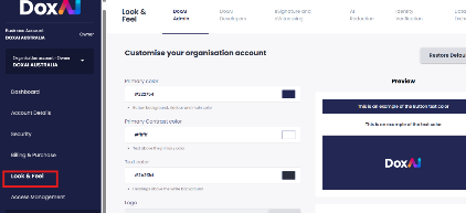
Example:
Was this article helpful?
That’s Great!
Thank you for your feedback
Sorry! We couldn't be helpful
Thank you for your feedback
Feedback sent
We appreciate your effort and will try to fix the article